TAMRYN A DOBBIE
POSTER DESIGN

COACHELLA

ROLL UP BANNER

NEW BALANCE

ANTHROPOLOGIE

DAVID CARSON

NEVILLE BRODY

PETER SAVILLE

SAUL BASS

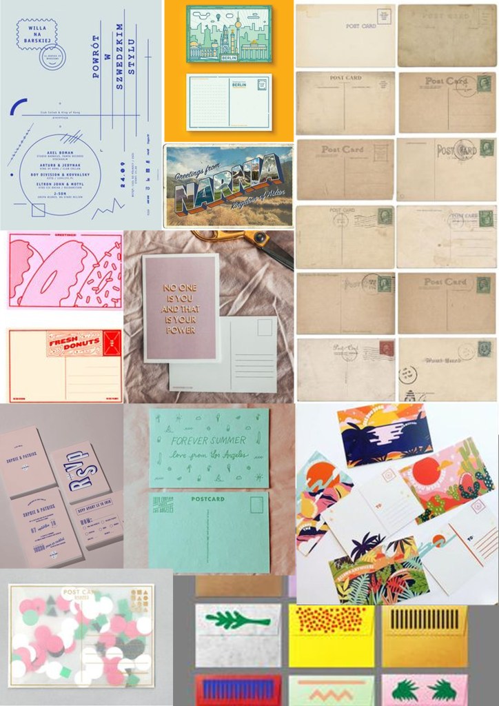
POSTCARD DESIGN
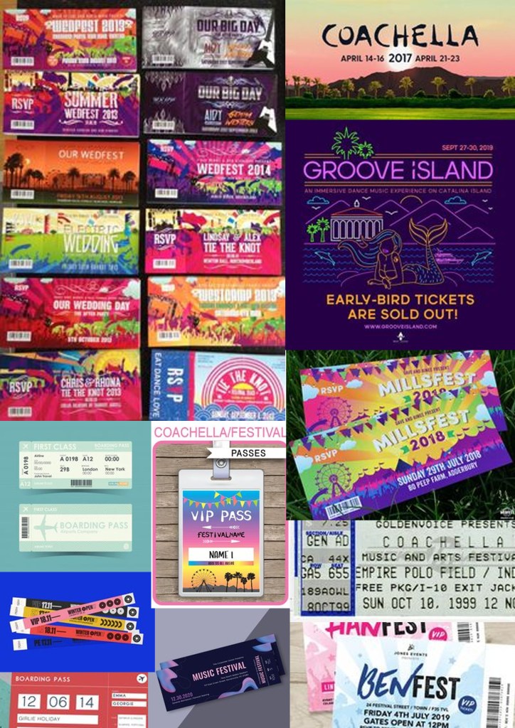
TICKET PASS DESIGN
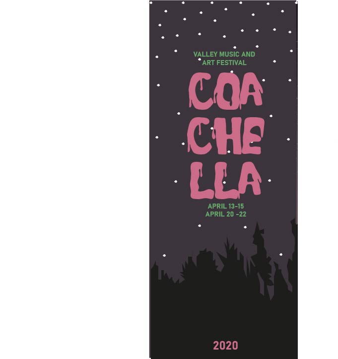
COACHELLA POSTER DESIGN

- I used photoshop to create my poster design shown above
- SIZE: A4
- RESOLUTION-300
- ORIENTATION-PORTRAIT
- I chose a royalty free image that was used throughout all designs instead of taking the image myself
- The idea behind the image was the sky at night that would be similar to the real sky during the festival as it is held at night at the Empire Polo Club in Indio, California, in the Coachella Valley in the Colorado Desert, which is out in the open air
- I copied and pasted the image and scaled it up to fit the A4 size
- I downloaded the font from online names SPOOKY DRIPS changing the colours from the swatch colour panel to match other designs
- I did not use any text effects like shadow or opacity
- I saved this file as a JPEG to then upload it onto the blog
TICKET PASS

- I used Photoshop to create the ticket pass shown above
- I set the page layout as size A5, resolution 300, Orientation Portrait
- I saved the background image that was used on all designs and uploaded it onto the page and resized to fit
- ctrl T was used to select and resize the image
- I downloaded a font from online named ‘spookydrips’ which then came up on the list of fonts in Photoshop which allowed me to select the font and use it again on the ticket pass.
- I colour picked the colours so they were all the same throughout my designs
- I then saved the file as a PSD as well as a JPEG file to allow me to fit it into my blog
POSTCARD FRONT AND BACK

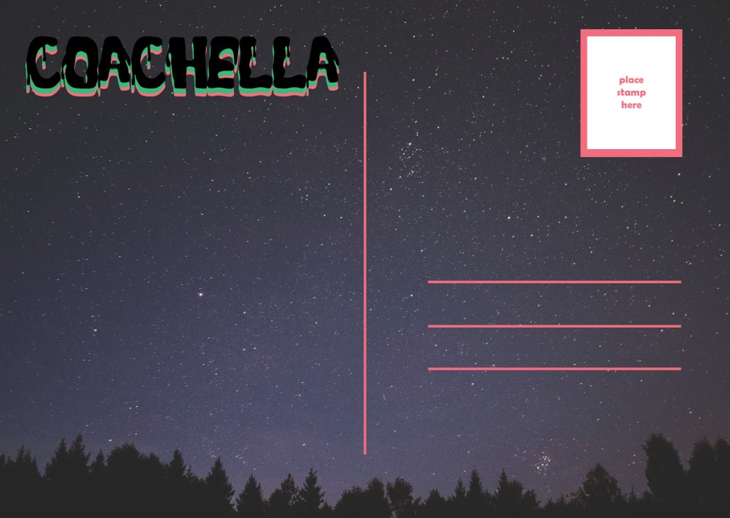
- I used photoshop to create the front and back design of my postcard shown above
- TYPE-SIZE: A6- 148mmX105mm
- RESOLUTION-300
- ORIENTATION: LANDSCAPE
- I uploaded the image from a site that provides royalty free images and therefore did not take the image myself
- I downloaded a font called SPOOKYDRIPS from the dafont website and used this throughout all designs
- I changed the size the size by the text drop down menu and changed the colour by selecting each layer of the text and colour picking the same pink and green throughout my designs
- I did not use any text effects, i just layered all three headings on top of one another which created the look above
- To prepare the file to be uploaded onto my blog, I chose to save it as a JPEG file
- I created the black lines shown on the back of the postcard by using the rectangle drawing tool and drawing skinny long rectangles to then change their colour to pink to match the on going theme
- I created the post card stamp by layering two different sized rectangle boxes on top of one another with text advising the user to place the postage stamp in the correct place
- I used Illustrator to create the roll up banner
- I used the template that was uploaded on my city
- Vector scale to avoid losing any quality when scaled bigger
- I did not take the image myself however I chose the image from a royalty free website ‘PEXELS’
- I placed the image from my files
- I used layers to lace the trees drawn on top of the background and grouped them together
- I chose the same font as the other designs called SPOOKYDRIPS
- I exported the file as a JPEG to prepare the file for the blog
